Using Worker Health Charts to Learn About Your Workplace
Posted on by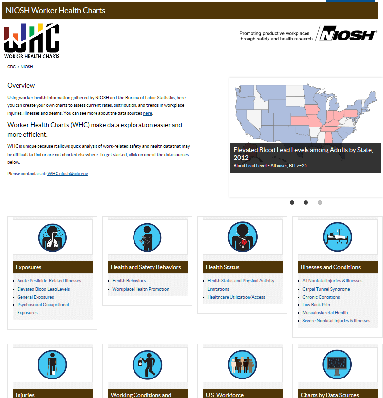 Jim manages a manufacturing plant that makes office furniture using plywood and other engineered wood products. Their worksite takes worker safety seriously, and is interested to know if the rate of severe injuries they are experiencing is high compared to injuries occurring at other office furniture manufacturing plants. This kind of information may be tricky to find, but in a search, he stumbles across the Worker Health Charts (WHC), a data visualization tool created by the National Institute for Occupational Safety and Health (NIOSH) that pulls from workplace safety and health data sets. Using Worker Health Charts, Jim is able to create graphic charts to visually show rates, distribution, and trends of work-related injuries, illnesses, and deaths.
Jim starts by selecting from a list of data sources or topics, including:
- Exposure
- Health and safety behaviors
- Health status
- Illnesses and conditions
- Injuries
- Working conditions and employment benefits
- Workforce characteristics
Jim clicks on “severe non-fatal injuries and illnesses” by “industry” and makes selections from the dropdown options and clicks “Apply Options”.
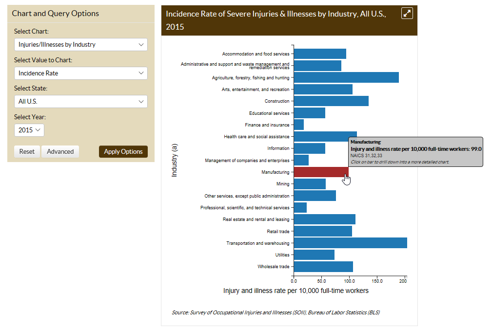
Jim finds the data interesting, but it isn’t giving him the information he was hoping for. In reading through the chart, he rolls his cursor over the bars within the chart, which highlight red and pop out specific details about the incidence rate for that industry. He clicks on the “manufacturing” bar, and a new chart is produced, which shows the different types of manufacturing.
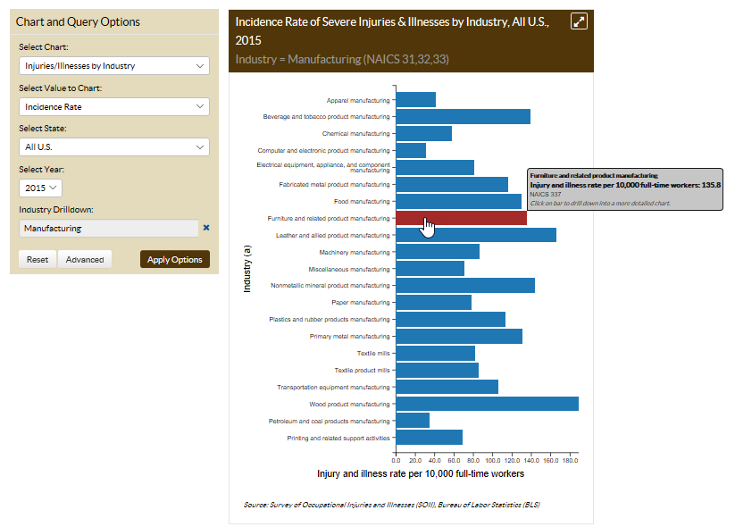
He clicks on “furniture and related product manufacturing” to further narrow the information displayed, and then clicks on “office furniture (including fixtures) manufacturing” to find the rate of severe injuries and illnesses among “wood office furniture manufacturers” based on data from the Bureau of Labor Statistics.
Jim feels this information is helpful, but he’d really like to know what kind of injuries are occurring most often. He notices an “Advanced” button and clicks on it. A box opens that allows him to further look at the data using a “filter” or “group”.
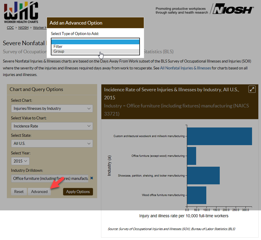
- “Filter” is used to restrict data to one specific category, for example: you can examine severe injuries and illnesses by age among office furniture manufacturing workers.
- “Group” allows you to select up to five different categories for comparison. For example, you can examine severe injuries and illnesses among office furniture manufacturing workers by exposure, time of day, part of body affected, among other options.
Jim clicks on “Advanced” and selects by “Group.” From the options provided, he chooses to chart “Part of Body Affected,” selecting:
- Upper extremities
- Lower extremities
- Trunk
From the chart he produces, he is able to see that in 2015, injuries to the trunk were the most commonly occurring among wood office furniture manufacturing workers at an incident rate of 54.2 per 10,000 Full-Time Employees.
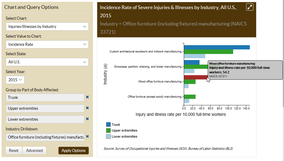
In looking through his injury logs, Jim notices most of his employee injuries occurred to the lower extremities, not the trunk like the Bureau of Labor Statistics data indicate. Jim begins to feel increasing concern. He decides to contact an occupational safety and health consultant to help him determine why his plant is experiencing high rates of lower extremities injuries.
This scenario is one way we hope that Worker Health Charts can be used by employers, workers, public health agencies and the general public to learn more about workplace injuries, illnesses, and deaths. And to identify where intervention and prevention efforts could be helpful.
Do you think this tool could be useful to you? If so, how would you use it? If not, what would you do to improve it?
Rebecca Tsai, PhD, is an Epidemiologist in NIOSH’s Surveillance Branch in the Division of Surveillance, Hazard Evaluations & Field Studies.
Amy Mobley, MEn, is a Health Communications Specialist in NIOSH’s Surveillance Branch in the Division of Surveillance, Hazard Evaluations & Field Studies.
Posted on by

